MAGE Magazine Tutorial # 1 : The production process for THE SAGA of LADY DOM - Part VI
- Apr 12, 2016
- 6 min read
After reading messages posted by Piper Chapman69 and Imajika Wirefly, I thought that some of you might be interested in reading about the process by which MAGE Magazine produces “THE SAGA OF LADY DOM”. While the entire creative team was involved in producing Episode VI, Ozymandius was assigned to shoot the backgrounds for this specific episode, since he had discovered two sims with interesting looking ruins.

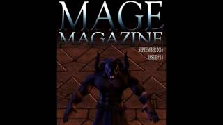
With this first image Oz used a vampire avatar, found in the inventory library folder common to all SL Residents. To make this avatar more unique, Oz added horns and a loin cloth. (In the context of the story this vampire avatar is known as VIGO the Gargoyle). Oz used a yoga hud pose called “locust" to create the flying pose then took a snapshot of the gargoyle against a very nice looking cloudy sky background. However I felt the original image wasn’t dramatic enough so I covered the sky background (sorry Oz) with three cloud layers that I rendered in Photoshop by clicking on the heading “filter” then “render” then “clouds". Each cloud layer was a different blend of orange and red, orange and black and orange and grey. I used an eraser brush to reveal the gargoyle hidden under the three “fire” layers, then adjusted the transparency of each layer until i got the effect I wanted. I also added a lens flare filter but it isn’t that noticeable.

On the top image of page 1 you can see the nice cloud work in Ozy’s original snapshot and the great highlight effect on the gargoyle’s shoulders. Whenever we shoot a scene, I always ask the background photographers, in this case Oz, to send me their snapshots and windlight settings as soon as they are complete, then I send copies to the other members of the creative team so they can match the lighting.
Andressa, who is the model for “The Killer” (the name given to the woman with the bat wings) did a great job at matching the background windlight settings because VIGO the gargoyle is the only character in the original snapshot and the second character was shot against a green screen background. Andressa sent me the snapshot, I removed the green screen background with photoshop then superimposed the Killer on the original background. The same procedure was used to make the second image on page 1, except I added multiple fire cloud layers to create the impression that Vigo is breathing fire onto the killer. (The dialogue and speech bubbles where created in photoshop.)

For both images on page 2 the only avatar in the original background was YAYO the Minotaur. Again it was Oz who shot the backgrounds then I sent copies to Sizzelle and Andressa. Andressa shot Felicia the Butterfly Fish against a green screen and Sizzelle shot MEZ the Werewolf and Violet the Fairy against a green screen. Sizzelle did a great job not only to match the windlight settings but the camera angle so it was easy to fit Violet and MEZ into the scene. Andressa also did a great job but I had to rotate the fish in photoshop to make it look like it is looking up towards the clouds. Again the fire clouds where created using photoshop and, because Felicia and Violet were superimposed layers, I could put this layer underneath the characters to make it seem like the fire was part of the background.

The images on page 3 were made the same way as the images on the previous page minus the fire clouds. In hindsight I should have reduced the size of MEZ because the YAYO the Minotaur avatar is huge and, if MEZ was actually standing next to YAYO he would be a lot smaller. (In case you want to get these avatars MEZ is a werewolf avatar that can be found in your library folder and I believe the minotaur avatar is called “Ukko” and can be purchased on the marketplace. Violet is a regular sized human avatar that I shrunk down in photoshop and Felicia the Buttefly Fish is an Alien Fish avatar you can get on the marketplace for 10 lindens and I think you can also get the butterfly wings on the marketplace as well.

The images for page 4 were photographed by Oz. The only post work I did was to boost the contrast and make minor color adjustments. Usually when shooting with multiple avatars Oz uses an anypose hud and rezzes multiple pose platforms. However this sim did not allow him to rez the platforms so we used dollarbie poses and Oz did a great job finding the perfect camera angle. While the shafts of light coming down from the trees were part of the sim, Ozy’s manipulation of windlight settings made the scene look even darker and more dramatic.

The images for page 5 were photographed by Oz, with Andressa playing the role of Aria and yours truly as Tyra the Tygress. Andressa got her costume at C & N Medieval designs from the Midnight Madness board. The hood is from a freebie monk ensemble she got on the marketplace so even though her avatar is covered from head to toe her outfit cost 0 Lindens. Regardless of the price tag I think it is a very impressive ensemble when you look at all the detail in the embroidery, wrinkles in the cloth, texture of the cloth etc.
The Tyra the Tygress costume was also inexpensive as the “Wild - Fur Bodysuit” tattoo layer is a marketplace freebie, 1 Linden for the A&A Makena Hair, 1 Linden for the Flub - Dandy face tattoo, 10 Lindens for the *SLAVE* Vanity redsilk ensemble and 10 Lindens for the bangles. Tyra also wears a gold chain collar that I found while exploring SL, it cost around 150 Lindens but I don’t remember the exact price or the name of the store. To be honest I was reluctant to use it since, under normal lighting conditions it looks like it is made from tin foil but Oz did an amazing job lighting the scene so I’m happy with the way it turned out.

For the first image on Page 6 Oz had to shoot Andressa separately because the rim light effect on Tyra’s Hair was being washed out by Andressa’s facelight so Oz shot the Tyra character in the original background and the Aria character against a green screen background. For the second image both characters were shot on a green screen background and superimposed on a cloud background provided by Oz.

All three images on Page 7 were produced by using cloud layers provided by Oz as the background then superimposing the characters shot against green screen. Before shooting a scene I send a copy of the script to the creative team and wait to receive feed back on how the scene should be photographed. Initially the second image in the sequence was supposed to be a closeup of the Killer’s profile as she has a dialogue with Vigo the Gargoyle but, in the end I decided to go with a wider shot because I wanted to establish that she had placed the arrow on her bow and was ready to shoot at Vigo. I believe the arrow cost 10 lindens and both Andressa and Oz had to buy one so Andressa would have one arrow to put on her bow and the second Oz could use to jab into Vigo’s chest.

The first image on Page 8 was shot with Tyra by herself then Aria superimposed as a green screen layer. The second and third images were shot by Andressa against a green screen background then superimposed on two separate backgrounds. Andressa did a great job making sure the angle and distance from the camera for both characters was precise so I could match the two sides of the Killer and Aria’s face. This was a very important image because I wanted to visually portray that Aria and the Killer are the same person. In the context of the story Aria will eventually become a powerful being who can travel through space and time. This power comes at a great cost so future Aria travels back in time to try and warn herself of the consequences of attaining absolute power.

All the images on Page 9 were produced by photographing the subjects on green screen backgrounds then superimposing them on cloud backgrounds. I’m very impressed by the ensemble Andressa created for the Killer (future Aria). For those of you familiar with our publication you will notice that the Killer’s costume has gone through some alterations. This was a tough choice to make because I wanted to stay true to the earlier episodes but we didn’t have much of a budget when we started to produce MAGE Magazine so in later issues you may notice an improvement in the quality of clothes and accessories.

The images for the last page were produced the same way as the images for page 9, except that I added the thick mist in the background for the top image and added fire cloud layers for the lower image. Hopefully you found this article educational and entertaining. If so please support independent art by joining the MAGE Magazine group, sharing and liking our you tube videos and adding these videos to your playlists. If you have any questions about MAGE Magazine, Second Life photography or machinima please send me a notecard.








Comments